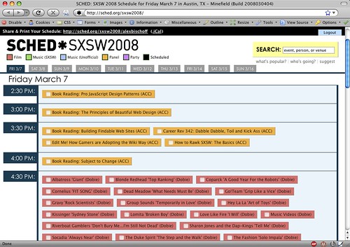
I’m going to SXSW this year (in fact, this weekend) and I was looking around for an online calendar that might help me plan which panels I was going to. (South by Southwest, in case you might not be familiar with it, is a music, film, and interactive festival/conference in Austin, Texas.) The sxsw.com website usually has a semi-usable calendar, but I just couldn’t get it to work this year.
Some friends of mine mentioned a third-party calendaring option, Sched.org, and I thought I’d give that a shot. I must say, I was pleasantly surprised. In fact, it’s great — it’s easy to use, intuitive, and uses just enough Ajax to be helpful without getting in the way. Anyhow, I’ve worked out my calendar and I think I’ve figured out most of the panels that I’d like to go to. As you might guess, if you see two panels listed for the same time slot, it means that I like both of them and just haven’t yet figured out which to go to. For instance, like these:
Saturday, March 8: Getting Unstuck: From Desktop to Device vs Opening Remarks with Henry Jenkins and Steven Johnson (both at 2 p.m.)
Sunday, March 9: Scope Creep and Other Villains vs Wireframing in a Web 2.0 World (both at 10 a.m.)
Monday, March 10: Targeting Your Web Site: Accessibility Litigation Update vs WaSP Annual Meeting: Don't Break the Web (both at 5 p.m.)
Of course, I’m open to ideas if you have any suggestions on resolving those stalemates. One way or another, I’ll figure things out :).

Sched.org is definitely leaps and bounds above the sxsw.org calendar. My only grip is that the hover behavior is a little manic. I seem to trigger it while casually mousing around. Also, when you click and add something, that hover popup fires anyway.
I wish they had a iphone mobile version!.
Yeah, I know what you mean about the hover behavior (though it didn’t bother me that much in the end). The one thing I might change would be to have a more full-featured account setup — that way, if I forgot my password or something, they’d have an e-mail address to which they could e-mail it to me.
I know you are so excited about SXSW! :) It looks *so* fun, especially the music conference (but that’s just me). At my conference I usually go to part of one session, get the handouts, and then go to part of the other. Good luck choosing, they all look fascinating! :)
Feedback on sched.org among my crew was pretty mixed.
My only major beef was a lack of “graceful degradation” — on the iphone, the hyperlink should have degraded to the permalink instead of the popup. Silly mistake, as it’s so trivial to provide a natural hyperlink and override it with an onclick handler.
Good point, Andyed. With any luck, maybe they’ll take that to heart when they go about making any revisions for next year’s version.
[…] I do every March, headed down to Austin earlier this month for SXSW. I also brought my new camera along, a Canon 40D which I’ve had since around February. To go […]